And these are just the posters!

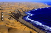
The coastline of Namibia, where blue ocean meets orange desert.
"All of Castlevania 1986's level palettes incorporated orange in some way. And often incorporated shades of blue, which is orange's complement. A.k.a., it makes orange 'pop out'"
—Egoraptor, "Sequelitis Episode 1"
|
In basic complementary color theory, contrast, as described downward, refers to any two polar opposite colors on the wheel. When used together in a single image, with almost no presence of any other colors, the effect is called a pop, or standing out clearly. In turn, the natural technique is to color films to have a strong, contrasting palette.
The one thing you will almost always have in a film is people. Human skin runs from pale pinkish yellow to dark brown, all of which are shades of orange. The color that contrasts best with orange is blue.
So you just turn up the shadows to the teal end, the highlights to the orange.
Unlike other pairs of complementary colors, which signal clear concepts, fiery orange and cool blue are strongly associated with opposing concepts — fire and ice, land and sea, day and night, invested humanism vs. elegant indifference, good old fashioned explosions vs. futuristic science stuff. It's a trope because it's used on purpose, and it does something.
More here, here and here (and more recently here). Games have (relatively) recently also picked up on this trend.
Subtrope of Mood Lighting and sister trope to Unnaturally Blue Lighting, as well a very specific and common form of Color Contrast and Color Wash. Not to be confused with Blue and Orange Morality (even when it overlaps with Good Colors, Evil Colors, as in Tron: Legacy). Ties in with Hollywood Darkness, which is usually blue or teal.
Has a vague resemblance to the Loudness War; in both cases, something is pushed Up to Eleven in post-production, removing all subtlety from the sound or picture. Can be a factor in Digital Destruction.
Films — Animation[]
- The Return of Hanuman
- The Adventures of Tintin has this prominently on the poster.
- The Blu-ray "restoration" of Fantasia uses this, most prominently in the "Night On Bald Mountain" sequence, where everything that was originally black is now blue.
Films — Live-Action[]
- The carbon chamber from The Empire Strikes Back is dimly lit with orange lighting and surrounded by blue-tinged darkness, providing an eerie contrast for the first showdown between Luke Skywalker and Darth Vader. It also predates the modern "Blue and Orange" phenomenon by about two decades.
- Blade Runner features this in almost every scene. It's part of its distinctive visual style.
- The Bourne Identity
- Night at the Museum
- G.I. Joe the Rise of Cobra
- Transformers (live-action movie)
- Spider-Man 2.1 (Spider-Man 2 DVD release)
- N.E.X.T.
- Secretariat, though to a lesser degree than most.
- The Transporter 2
- Tron: Legacy: The actual movie itself consists mostly of this. This movie could have been grandfathered in, the original Tron was mostly black-and-white with Red and Blue glow-lines. For the sequel they kept the Blue glow intact, but then they went and tweaked the Red to be various, mostly Orange-ish shades.
- Iron Man 1 & 2
- The later movies in The Fast and the Furious series exhibit this trope:
- The Fast and the Furious: Tokyo Drift
- Fast & Furious
- Fast Five
- Feast of Love
- The Hangover
- Serenity, one of the first to do this the way 2000s movies are doing it
- Limitless
- Rabbit Hole
- The Last Airbender
- In Hollow Man, invisibility serum is blue and counterserum is orange. Also, in thermal vision living organisms are mostly orange/red and the environment is mostly blue.
- Cowboys and Aliens, might as well be called Orange and Teal.
- The Doors by Oliver Stone uses this a lot, especially in the drug use scenes.
- Easy A.
- The Indian film Rab Ne Bana Di Jodi is strong with this — but more with yellow-blue than specifically orange-blue.
- Drive. In the opening sequence, the only colours (with the exception of the pink title) are the blue and orange coming from the lighting in Los Angeles at night.
- Live Free or Die Hard — in places you would swear you're looking at a race of orange humans.
- The song and dance number in Om Shanti Om called Dard E Disco has lovely orange blue contrast with gold tones for about 3/4 of the song.
- Minority Report
- Film/Sunshine
Literature[]
- The junior novelization of Guardians of the Galaxy Vol. 2 comes out and leads with an "orange-and-teal convertible". At dusk. Also, it's summer.
Live-Action TV[]
- The sixth series of Doctor Who is virtually bichromatic.
- Burn Notice uses this all the time too. Watch out for Michael's orange skin, paired with a light blue shirt. Happens almost every other scene
- Instant Star used a blue filter for the school interior sequences, to better match the late 19th/early 20th century stone High School building they used for exteriors and disguise the interior sets built for the midcentury-modern Degrassi school building.
- Interesting use in Awake, where the two different universes that the show alternates between each get their own color pallete: Red/orange for the reality where Britten's wife is alive, and green/blue for the one where his son is. It actually serves a purpose in making it obvious to a careful viewer which one the scene is taking place in.
Music Videos[]
- The music video for "Remember the Name" by Fort Minor is between this and a green wash. While Mike is rapping, it's more this, while Ryu gets the greenest parts.
New Media[]
- In its four-color mode — the one used by boot screens and the Workbench UI — the Amiga originally used black, white, blue, and orange.
- Also one of the display palettes for the Apple II, though not as commonly used as black, white, green and purple/magenta.
- Google always had blue links, now it's using quite a bit of orange as well.
- Psst... Check out the color scheme on This Very Wiki.
- On that note, Trope-tan.
- The Firefox logo and default color scheme.
Pro Wrestling[]
- Unlike most wrestlers in WWE, Sin Cara has special lighting during his matches. Said lighting is orange and blue. Sin Cara's ring attire and entrance video are also orange and blue.
- Wrestlemania XXVIII utilizes this for their poster.
Video Games[]
- Mass Effect. Also on a meta level, the first game used a lot more clean blues and whites in game and the user interface was blue, while the second switched to gritter oranges and browns and the user interface turned orange.
- Too Human
- Crash Bandicoot is a walking orange-blue contrast.
- Monday Night Combat; the Hotshots and the Icemen team colors are, respectively, a dull orange and dark blue.
- Tomb Raider II - Some of the level with the Maria Doria are strongly orange/teal. Surprisingly for a non-realistic PC game from 1997.
- Vagrant Story
- Portal
- Not the game or the packaging, but the two portals you can shoot are orange and blue. In Portal 2, the Propulsion and Repulsion Gels are orange and blue, and the Excursion Funnel is blue when pushing and orange when pulling.
- ATLAS and P-Body, the two co-op robots in Portal 2, have blue and orange colouration respectively.
- Also, the two main A.I. have opposite coloured optics. GLaDOS' is orange, and Wheatley's is blue.
- In fact, just about everything with two states in Portal 2 alternates between blue (off, inactive) and orange (on, active). The blue dots on the walls linking buttons and items turn orange when buttons are pressed, the big pressure buttons and the cubes to depress them are trimmed in pale blue, but light up orange when active, cube droppers light up orange when they're dropping a cube...
- This was inherited from the Spiritual Predecessor, Narbacular Drop.
- The giant clock venue in Rock Band has shades of this, more so in the second game than the third.
- Jagged Alliance
- Outland. At least it served a gameplay-important purpose....
- The video game adaptations of Harry Potter use practically only blue and orange shades throughout the game.
- Every boxart for the classic Mega Man series features this.
- Metroid Prime 3: Corruption used this for box art and other artwork, but not quite as much for the game itself — while blue is rather prominent because of Phazon becoming more abundant, orange is largely limited to Samus and her gunship.
- The Legend of Zelda Skyward Sword exaggerates it for the Silent Realm in order to emphasize how alien the alternate dimension is. However, everything turns red whenever Link is spotted.
- The new Mortal Kombat has this on the cover and, to a lesser extent, on the main menu background; both achieve this by putting Scorpion and Sub-Zero opposite each other.
- The title screen of Aleste 2 features redhead Ellinor Waizen and the title in red-orange lettering against a deep-blue background.
- Singularity: only in the time-warped alternate-2011, though. In 1955, a more normal color palette is used. This is to help show off the unnatural state of the world in 2011.
- Sonic and Tails of the Sonic the Hedgehog series, where the titular hedgehog and his fox companion are colored blue and orange respectively.
- As noted in the page quote, the original Castlevania 1986 for the NES had most, if not all, of its foreground scenery orange, complete with many blue backdrops throughout the game. Even Simon's sprites were a yellow-orange to help him pop out. Averted in Vampire Killer for the MSX2, which used a color palette of more subdued browns and shades of gray.
- X3: Reunion's boxart. Also, many ships are rendered in blue-gray, and many sectors are lit in red.
Webcomics[]
- Penny Arcade's website.
Website[]
- Cracked calls it the #4 annoying trend that makes every movie look the same.
Western Animation[]
- My Little Pony Friendship Is Magic gives the orange Applejack and the teal Rainbow Dash a friendly rivalry in-series. While this is mostly a bonus for the toy box art, this has rarely been used due to miscommunication between the animation and toy divisions.
- The Amazing World of Gumball's Gumball and Darwin.
- Hey Arnold uses this in their credits, popping the yellow names of the crew out of the blue backround. And in the Halloween special, it was actually orange.
- In Avatar: The Last Airbender, the Grand Finale has two determining fights happening in parallel: Aang/Ozai and Azula/Zuko. Both were red, or a kind of orange, versus blue. But in one fight, Blue was good, in the other, blue was evil.
Real Life[]
- Many schools, including Auburn University, Boise State University, the University of Florida, the University of Illinois, the University of Texas San Antonio, and the University of Virginia use blue and orange for their color schemes, although the exact shades vary.
- Following the 2011 Canadian federal election, the government was split with the Conservative Party of Canada (blue) in power and the New Democratic Party (orange) forming the Official Opposition.
- Titan, the largest moon of Saturn, has orange clouds, but a dark blue atmosphere.
- Sunsets on the blue-colored Earth are colored orange, but sunsets on the orangey-red Mars are colored blue.
- The Edmonton Oilers and New York Islanders of the NHL both have blue and orange colour schemes for their jerseys.
- While not exactly orange, the flag of Sweden uses the blue and yellow from the Natural Color System, which creates pairs of complimentary colors that do the same thing as this trope.
- In a variant one step up the spectrum, the red/green palette commonly associated with Christmas also uses contrasting colors that "pop".
- The Denver Broncos football team's colours are orange and blue.
- So are the Chicago Bears.
- The 1970s and 1980s logos for ITV company LWT had blue and orange stripes.
- The NTSC analog television system's YIQ color space has the orange and blue contrast along the in-phase (I) axis and the green and purple contrast along the quadrature (Q) axis. More bandwidth is allocated to I than to Q because the eye is more sensitive to orange and blue contrast.