"My H has been stolen! Awww, that's how people know it's a Honda. Why would you drive a Honda if you can't show it off?"
—Superintendent Chalmers, The Simpsons
|
Sometimes, you can recognize a franchise almost instantly by the characteristic way it writes its name, or the iconography associated with a brand or franchise.
This is an Iconic Logo.
This trope is for franchise logos that have become so associated with their particular franchise that changing them would be unthinkable, even if this is not the logo the franchise originated with.
While obvious, it's still worth noting that achieving Iconic Logo status is, ideally, the end state of every logo; they are, after all, intended to be the corporate equivalent of a signature: unique and recognizable at a glance.
See also Conspiracy Placement, Logo Joke. A Mascot might be part of the logo. These are often used as a Vanity Plate.
Examples of Iconic Logo include:
Corporate Logos[]
- Disney's Mickey Mouse head.
- Walt Disney's "Signature" logo, (designed by an artist at the studio, not Walt) was so famous that Disney himself had trouble signing autographs. Every time he did, people accused him of being an impostor because his signature didn't match the logo.
- The Nike 'Swoosh'.
- The Coca-Cola logo. The "New Coke" change in formula also got rid of the iconic logo.
- The McDonald's golden arches were not the company's first symbol - they were introduced in 1962 and refined to today's version in 1969 - but it has become known the world over as a shorthand for fast food.
- The Playboy Bunny Head.
- Colonel Sanders's head.
- The computer industry has some of the most unambiguously recognizable logos known to man. Logitech's eye, Razer's three snakes, nVIDIA's own "eye", ATI's red rectangle, the Cisco bridge, the list goes on.
- Contributing to 3dfx's demise was their change away from their iconic "splash" logo, which was a household name among PC gamers.
- Intel's dropped "e", then followed by the "Intel Inside" logo.
- Gateway's "cow cube".
- The Silicon Graphics cube, symbolic of its onetime preeminence in 3D graphics. The company's decision to drop this logo coincided its decline from relevance. (They eventually reversed course.) Deliberately imitated with the cubed N logo used by the Nintendo 64, which was (both in hardware and software) essentially a stripped-to-the-bone Indigo.
- Alienware's alien
- The LEGO square.
- Many airlines have iconic logos, most of which are referred to by affectionate nicknames such as the classic Delta "Widget". Like anywhere else if you should dare to make it just a little different, be prepared to accept the consequences.
- The recent merger between United and Continental has taken this to ridiculous levels. In the 1970s both airlines introduced logos designed by the legendary Saul Bass, the "tulip" and "meatball" respectively. After Continental's 1991 bankruptcy they rebranded with their globe logo still used to this day. With the merger the decision was made to keep the United name with the Continental look. Cries of Ruined FOREVER came about at the thought of another classic Saul Bass logo being replaced with what one forum poster referred to as "the whiffle ball" among others who just thought it was butt ugly. A couple months after the announcement they caved to the latter group and created a new typeface for the name which was much more well-received although didn't take away criticism from those who who thought they still should have retained the tulip and United's existing look[1] or come up with something entirely new.
- A number of other iconic logos, such as the American Eagle, Air Canada Maple Leaf, Lufthansa Bird...thing, Qantas Kangaroo (slightly modified in 2009), and KLM Crown have stood the test of time. Even some of the ones that didn't have managed to find alternate applications, thanks to creative trademark lawyers.
Anime and Manga[]
- The Gutsy Geoid/Galaxy Guard's "GGG" emblem is iconic of GaoGaiGar, and recognized as a symbol of ' courage and guts'.
- NERV's logo is every bit as popular as Neon Genesis Evangelion.
- It even received a nice update for the Rebuild movies.
- In The Melancholy of Haruhi Suzumiya, we have the SOS Brigade's logo.
- The Laughing Man logo from Ghost in the Shell, complete with spinning text for additional creepiness.
- The logo for Team Gurren, a flaming skull wearing Kamina's signature glasses. This symbol was so popular a bunch of trolls stuffed a BBC poll for a new UK flag design and got it emblazoned on the front of the Union Jack.
Automotive[]
- The Ford script in a blue oval.
- The Toyota "Pretzel".
- BMW's "propellers," as well as Mercedes's logo (which is often parodied as a crosshairs).
- Occasionally, some dumber than advertised peace protesters leave the third lower leg out of the Peace Sign, making it look like they're showing their allegiance to Mercedes.
- General Motors has its blue square, and each of its divisions have their own iconic logos:
- The Chevrolet bowtie
- To that: The Corvette series' red and checkered flags, which varied between each generation of Corvettes, including but not limited to, the C4 Corvette's checkered and red label with the bowtie in the red flag, the C5's logo with criss crossed flag shafts, and the C6 corvette showing the flag shafts being connected at eachothers end.
- The three shields of Buick
- The Pontiac arrowhead
- The Cadillac shield
- The minimalist planetary icon of Saturn
- And in Europe we have Vauxhall Motors' Griffon (which predates GM ownership) and Opel's circled lightning bolt
- The Chevrolet bowtie
- The Mitsubishi diamonds, which applies to the entire Mitsubishi conglomerate (cars, chemicals, electronics, etc.).
- This was designed to evoke the style of Japanese mon seals, and literally means "three water chestnuts".
- The Chrysler Pentastar, which was used for all of its divisions (Dodge, Jeep, and Plymouth) for a while in the '80s and '90s. Since its restructuring from bankruptcy in 2009, Chrysler now uses it as its corporate logo.
- Dodge's logo of a Ram or a Viper for the Viper Series
- The Ferrari prancing horse.
- As well as the Porsche prancing horse.
- The Lamborghini bull, which is linked to the company's tendency to name its cars after famous bulls from bullfighting history.
- Volkswagen's stacked VW in a blue circle.
- Audi's four interlocked rings.
- The Honda H, as referenced by the quote at the top of the page.
- The Maserati trident head.
- McLaren's Starfleet-ish (tilted to the side on it's right and red) shape to the top right of their name. The only time it was shown by itself was on the MP4-12C's steering wheel while the SLR had the afformentioned MB logo on the wheel.
- And before that, the F1's name being spelled in it's special font could count as the logo at the time.
Film Studios[]
- The Warner Bros shield.
- The Paramount Mountain (or, the Paramountain).
- The Universal Pictures globe.
- Leo the Lion for Metro Goldwyn Mayer Studios has been in use for decades (53 years and counting).
- Luxo Jr. for Pixar.
- DreamWorks' boy sitting in the moon.
- Columbia holding a torch for Columbia Pictures.
- Tri Star's winged horse. When the studios merged, they just used both logos rather than change them.
- 20th Century Fox's building-sized title. The Fanfare that accompanies it is also iconic.
- Disney's Magic Castle.
- The Rank Organisation's "gong man".
- Gaumont's daisy.
- For Australians, Village Roadshow's "V of Doom".
- Viacom has a "V of Doom", too.
Comic Books[]
- The Superman logo, with its big block letters at a slant, has been used on almost every Superman comic since the 40's, and most of the movies and cartoons, to say nothing of his familiar Chest Insignia. Superman's Dork Age costume change in the 90's was accompanied by a new "edgier" and "extreme" logo. Needless to say, it didn't take.
- The Action Comics logo has achieved a similar iconic status. While it was unused for a while, it was brought back early this decade to much fanfare.
- The chest insignia is iconic enough that the long-forgotten Ruby-Spears cartoon didn't even bother with a title card. Superman the Animated Series did the same thing.
- The Batman insignia is so iconic that the DVD release of the 1989 movie used it instead of a title on the cover.
- The Joker's playing-card insignia also counts.
- The X-Men X-in-a-circle.
- The Incredible Hulk logo, with "Hulk" written in big, blocky letters meant to look like bricks.
- Captain America's shield, which was actually the second shield he used.
- The lightning bolt used by Captain Marvel and associates in Shazam comics.
- The bloody smiley face from Watchmen.
- Spider-Man's tends to be a black spider (like the front of his costume) or a red spider (like the back of his costume), but the circular depiction of his mask is also popular.
- The Avengers' "A" symbol.
- The Green Lantern's lantern.
Film[]
- The Star Wars logo has been used ever since the first film. Ironically, it wasn't on the earliest posters for the film.
- Also, the rebel alliance and empire symbols, especially for EU materials.
- To quote a famous Audience Participation line-"Let there be lips!" (In other words, the lips from Rocky Horror are pretty iconic...especially the picture of Frank N. Furter lounging around on them).
- The 'Indiana Jones' logo has remained the same since Raiders of the Lost Ark with the same orange-red color scheme.
- While the swoop and the color scheme has remained the same throughout the series, the words "Indiana Jones" didn't appear in the orange-red swoopy typeface until "Temple of Doom." The swoopy red-orange type first appears in the Raiders of the Lost Ark movie poster, but not in the actual film credits.
- The Harry Potter font used in the movies is identical to the one used on the American cover of the books, complete with lightning-bolt P.
- The Back to The Future logo, with its fading red-to-orange-to-yellow text and the arrows.
- The Jurassic Park logo.
- Ghostbusters ghost-in-the-"no"-symbol logo
- Also the Ghost-doing-a-peace-sign-in-the-"no"-symbol from the second movie, which is parodied more often.
- James Bond's 007-with-the-7-as-a-gun.
Literature[]
- The Harry Potter font used in the American editions of the books has become associated with the series, especially given the distinctive lighting-bolt tail on the P. The original British editions just used plain text on the covers.
- JRR Tolkien's monogram, which appears on pretty much every book related to Middle Earth.
Live Action TV[]
- The pervasive DHARMA Initiative logo on Lost.
- Star Trek has the Starfleet logo.
- Interestingly enough, this symbol was used in the original series as a symbol for the Enterprise specifically- other ships had their own badges. Apparently the Enterprise's exploits were so legendary that the rest of Starfleet adopted the symbol, even retroactively.
- Heroes has both the eclipse from the title card, and the RNA strand that appears through the series.
- The Power Rangers lightning bolt, in both its original gold Mighty Morphin Power Rangers incarnation and the standardized silver bolt from Power Rangers Zeo onward. It remains to be seen how Disney's newly designed "MMPR Remastered" bolt will take in the public's eye.
- Evidently not too well: Power Rangers Samurai went back to the previous bolt, though changed it back to gold.
- On the other side of the world, Super Sentai is known for a golden "V" for five, which was remodeled temporarily at the thirty mark with three X's being placed around it.
- Though nowhere near as iconic, the thirty-five mark, Kaizoku Sentai Gokaiger, intentionally invokes this trope in the same way as Super Smash Bros. (see below), associating each of the 34 previous Sentai teams/seasons with an emblematic icon (usually a detail found on their costumes) - these icons usually flash when the Gokaigers transform into another team.
- Charlie's Angels has the shadow of the three girls in poses, which is so iconic that it is still being parodied decades later.
- The Stargate Verse has its Earth symbol.
- The Buffy the Vampire Slayer font is unique enough that it is easily recognizable, and even just the letter "B" by itself is easy to recognize.
- Doctor Who has many iconic logos displaying the series' title. The one used for the Eleventh Doctor features blocky blue writing with a DW reminiscent of the TARDIS (complete with light) separating "Doctor" and "Who".
- The uppercase-X-from-an-old-typewriter from The X-Files.
Music[]
- The Rolling Stones' Tongue and Lip logo, designed by John Pasche.
- The Beatles "dropped T" logo. Or the apple, you choose.
- Aerosmith's "wings".
- Metallica lightning font. Again, their Dork Age in the '90s coincided with a short-lived redesign.
- ACDC's lightning bolt used as a /.
- Queen's crest.
- Blue Oyster Cult's Hook and Cross, at least for those in the know. (This is the alchemical symbol for lead, a very heavy metal.)
- Public Enemy's silhouette in rifle scope.
- Nirvana's "Have a Nice Day" Smile.
- ABBA's "reverse B/forward B" logo.
- The Monkees' bright red guitar logo (with heart-shaped tuners!).
- Van Halen's winged "VH" logo.
- Iron Maiden's font.
- Guns N' Roses' pistols with a rose around each.
- Chicago's Coca-Cola-esque logo.
- Led Zeppelin has both the distinctive font and the symbols representing each member of the band. There's also the zeppelin itself which often appears on album covers.
- Journey is represented by the scarab beetle on most of their album covers.
- Nine Inch Nails has the distinctive "NIN" logo where the second N is reversed.
- Pink Floyd doesn't have a logo as such, but the band's name rendered in "Scarfe Script" (used in 1979's The Wall) serves this purpose. The same goes for Roger Waters. Pink Floyd has a few logos, actually: the "pig" from Animals, the Prism from Dark Side of the Moon, and the crossed-hammers insignia from The Wall.
- Yes' overly curvy logo. They, too, had an Iconic Logo-less Dork Age.
- Roc-A-Fella's classic Roc pieces.
Networks[]
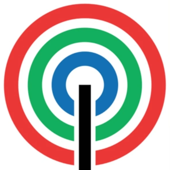

- Pictured: ABS-CBN's transmitter and signal logo, which underwent a few changes in structure, appearance, and color, but had its overall design relatively unchanged.
- The NBC peacock logo (in various guises) has been in use since the early days of color television. It even got a Shout-Out in a Disney animation in which Professor von Drake explains the color spectrum.
- In fact, they were the first network with (NTSC) color, and even boasted by 1965 that they were the "all-color network" (not quite true, but still...)
- The CBS eye logo, likewise. Even as six decades passed, the design is still the same. Sounds quite immortal, huh?
- The FOX searchlights. Various parodies note how the "20th Century" part of the logo has been outdated for some time and "update" it, such as Futurama's closing titles playing with a "30th Century Fox" logo.
- In "That's Lobstertainment", the searchlights are used to cause plane crashes so they can be filmed for use in their movies.
- The MTV logo with a large M and the letters "tv" written inside of it. It even got into Formula 1.
- Inexplicably cut in half at the beginning of 2010 to tell us what they've finally realized fifteen years after the audience knew it: they aren't "Music Television" anymore.
- The "TV" lettering was also subtly amended to make the bumps smoother.
- The Nickelodeon orange splat and its many variations.
- Which was replaced with a new cross-branding logo across all of their various networks which resembles the logo used by an eighth-rate pizza place in the 1970s. Oddly inspired by the needs of the network's suits to have a neat business card. Really. The logo of "the first network for kids" was seriously changed to look nicer on something only adults in the broadcast industry care about.
- Same for the (US) ABC logo (although it got some gloss in 2007 to 'modernize' it).
- Numerous temporary tweaks have been made to the ABC logo over the years, but the basic design of the lower-case "abc" inside a circle has remained the same since 1962.
- The "Circle 7" (designed for ABC's owned-and-operated stations, which were all on channel 7, in 1962) can probably be considered one of these as well, despite not being as ubiquitous. It was designed to be interchangeable with the ABC logo; this idea has been eschewed in recent years, as most stations that use the Circle 7 usually do so in conjunction with the network logo.
- The Canadian network CBC is known by many older people as "that station with the exploding pizza logo".
- The UK's Channel 4 logo, a building-block style "4". Decoloured, but otherwise not changed since 1982.
- The BBC logo since 1997 with the three squares and B, B and C written in each of the squares in negative space. Before 1997 the boxes were slanted and underlined; before that they weren't underlined, but had rounded edges.
- The current font was designed many years before by Eric Gill, who also sculpted the "Prospero and Arial" statue on Broadcasting House, the BBC Radio HQ.
- The BBC 1 spinning globe, until it was retired at the start of the century.
- Although it was brought out of retirement on occasion for time-travel police dramas Life On Mars and Ashes to Ashes.
- The BBC 2, er, 2, despite the multitude of different idents created since 1991. The 2 was tweaked in 2007, making the counterform in the left part of the logo larger.
- The Thames skyline - largely thanks to Benny Hill. It even made an appearance on The Simpsons - "British Television But Not The BBC".
- The Granada G-arrow (or unicyclist-with-umbrella) in Britain.
- Likewise, several of the older ITV companies' logos - The ATV Shadowed Eye (based on CBS), the Central Moon, The Yorkshire chevron the main ones, largely due to frequent playings - it was standard for two station idents to precede programmes: The station broadcasting first, then the station who produced/imported the programme.
- Not necessarily. Some stations ditched opening continuity announcements temporarily and went straight to the logo of the station producing.
- Likewise, several of the older ITV companies' logos - The ATV Shadowed Eye (based on CBS), the Central Moon, The Yorkshire chevron the main ones, largely due to frequent playings - it was standard for two station idents to precede programmes: The station broadcasting first, then the station who produced/imported the programme.
- The ABC in Australia has used a lissajous curve for its logo since 1963. The logo itself has been updated a few times, starting off as a line, then it gained width, then became 3D.
- Nine Network of Australia has used nine dots since the 70s. They dropped the dots in 2006, and many Aussies saw the drop as the start of Channel Nine's Dork Age.
- Incidentally, that Dork Age ended after Nine relaunched its logo in 2008 to reinstate the dots. They were a bit bigger in the new logo, but reverted back to their normal size in another new logo launched in 2009.
- Parodied on ABC's Channel Nine Show, the main joke apparently being that it wasn't actually on Nine.
- Cartoon Network's checkerboard logo, still used on its Vanity Plate years after its on-screen identity was changed to a white C on a black square and black N on a white square in 2004. The font (David Berlow's Eagle Bold) remains consistent between both, and has seen increased use on the channel outside of the logo.
- CNN's connected letters, largely untouched since their 1980 sign-on. The only real change, made at some point in the 80s, was that the "C" was made less wide, while the first "N" became wider.
- NHK's three eggs.
- Fujisankei Communications has it's own distinct eye logo, which is used for the parent group and for certain subsidiaries (Fuji TV, Pony Canyon, etc.).
- The PBS head.
- The HBO logo, a relatively easy to duplicate logo (a Helvetica-esque "H" and "B" with a round "O" that includes a dot within it) that has been used in two different variants (one used from 1975 to 1980, and the current version used since 1980 with slight alterations to the "B" and "O") and became synonymous with the network due to the "HBO in Space" feature presentation sequence used between 1982 and 1999, that featured a metallic HBO logo (which was in fact a scale model, as was the rest of the sequence) rotating across a space background with moving stars behind it near the tail end of the sequence that then transitions into a series of light rays that move across and inside the "O" to reveal the type of program being aired ("HBO Feature Presentation", "HBO Concert", etc.).
- The Sci Fi Channel's ringed planet emblem, before becoming Syfy.
- Brazil's Globo TV has had its "circle in a TV screen in a circle" logo since the mid-70s. Interestingly, the "TV screen" part of the logo recently became more elongated to reflect the change to widescreen format.
- The logo has evolved thru the years: It started off as a blue and white globe, then gained a metal texture, then gained rainbow colors on its screen. From 1992-2005, only the metal texture of the logo has been constantly tweaked, then became a bit lighter on 2005, and then the colors changed from triangles to scan lines, the texture became more simplified and the screen became more elongated and finally in 2014, the metal texture was eliminated for a simpler gloss texture, while the screen's colors gained a gentle wave motion effect.
- SBT's circle logo, which is much of an Expy of the logo of ABC (of USA). It has evolved several times, from a gold ring, to a circle with multicolored stripes, then to having multicolored gradients, then into a multicolored disco ball of sorts, and finally, into a 2D circle, which turns out to be much of an Expy of the logo of iOS' Photos app.
- Rede Record also has one which has taken on different forms: a globe with curved RGB metal plates, then into a globe (which would soon become the Earth) with tsunami waves (also in RGB), and then into a blue globe with RGB plates stuck on it.
- The design website Brand New once deemed the first version of the logo as a "downright, ugly globe logo with a tsunami icon", as it resembled tsunami waves covering the Earth, and relatively, the present version, used since 2012, as a highly polished globe.
- The "ball with colored stripes" logo of Sat.1. The stripes were multicolored, then became red, then pink, then the ball became 3D, and then the stripes became multicolored again.
- The M logo of Rede Manchete, which has five dots connecting each other to form an M, had its design untouched and has stayed the same until Rede Manchete closed down on 1999.
- Rede Bandeirantes' eye logo, which has evolved several times and has taken on different colors. Also, it is an Expy of CBS' eye logo. Prior to that, they borrowed the peacock logo of NBC.
- GMA Network: The network has been using the "rainbow heart" logo (which they fondly call "Kapuso") since 2002, and has become a symbol of the network's ascension to ratings dominance, and then its Dork Age of sorts.
- Before that, the network used various logos, such as a box and a rainbow (the latter of which, surprisingly, turned out to be an inspiration of the Kapuso logo which they are using now).
- Seven Network's logo, which is a seven formed by two trapezoids, used since 2000.
Operating Systems[]
- The Windows flag has changed its design over the years, but the general colors and "waviness" have not changed.
- With the upcoming release of Windows 8, the logo has been modified to monochrome[2] tiles reflective of the OS's new "metro" look that actually looks, shockingly enough like a window.
- Tux the penguin for Linux.
- Every famous Linux distro has one of these. The Gentoo "hand", the Ubuntu circle, the Debian spiral... you get the picture.
- The BSD "daemon".
- Apple's apple, made a bit blander with the removal of its old rainbow coloration.
- An interesting example of a logo that happened by accident: The makers of the Commodore Amiga home computer created an animated demo to show off their machine's graphics capabilities. One element of this demo, a rotating ball with a red-and-white checkerboard pattern (so you could tell it was rotating), quickly became so heavily associated with the system that a higher-quality version of it became the logo of AmigaWorld magazine and, eventually, the company itself.
- Android and the green robot. There's even android puppy!
Tabletop Games[]
- The Warhammer and Warhammer 40000 block font logos and probably a few others for each franchise.
- Legend of the Five Rings has the distinctive Clan mon, each a circle containing a stylized image of the Clan's namesake animal depicted in the Clan's color.
Video Games[]
- The Nintendo logo in the oval.
- The Electronic Arts logo. EA Games or EA Sports in a silver ring from '99 to '06. Black (or coloured diferrently depending on game) from '07 and onwards. Of course, the EA Sports "It's in the game" and EA Games's "Challenge Everything" are iconic taglines.
- The Marathon logo pops up a few times in the game, in places where you'd expect, such as the title screen, doors and terminals. Naturally, it is used to represent the entire series. It's also used in Halo, both as obvious references and hidden easter eggs. There is a strangely high number of fan-made drawings of the logo.
- There's also the Pfhor, Tycho, and Jjaro logos, which anybody who's played every game will remember.
- The vast majority of game consoles have one of these, starting with the Sega Genesis's stylized typeface. Then the SNES's four circles (not used in North America for some reason), the Play Station "PS" logo, the Saturn orb, the Nintendo64's N-cube, Game Cube's G-cube, Play Station 2 (and PSP)'s line-art, the Dreamcast spiral, Xbox's green X, and now, the Wii's stylized typeface, the PlayStation 3's initial stylized typeface, and the 360 X-sphere.
- The PlayStation 3 has switched to line-art similar to what the Play Station 2 used.
- The initial PlayStation 3 logo typeface is perfectly recognizable — the same one used for the live-action Spider-Man movies' logos!
- Sony is also working hard to make the CrossMediaBar (XMB) their iconic interface, using it in Sony TVs, DVD players, and, of course, gaming systems.
- The PlayStation 3 has switched to line-art similar to what the Play Station 2 used.
- The Legend of Zelda has used its logo since The Legend of Zelda a Link To T He Past. The Legend of Zelda Ocarina of Time's logo, with the shield and Master Sword behind the Z, has often been used to represent the entire series.
- The Triforce is an even more iconic symbol of the series.
- Atari's logo is also pretty recognizable.
- The Halo logo with its indicative "O" is known almost everywhere by now. The O is so indicative of the series that the promotional logos of Halo 2 and Halo 3 were the numbers 2 and 3 inside the O.
- The Lambda inside of a circle is the iconic logo of Half Life.
- The Mortal Kombat dragon.
- The Sega logo.
- Sonic the Hedgehog's silhouetted head, used by both the franchise and Sonic Team.
- The Konami logo, which used to be an instantly-recognizable pair of red and orange squigglies arranged in S form, but which they then charged to dull white text on a red slanted edge shape for whatever nonsensical reason.
- Prior to the "red-and-orange sqiggles", they had a logo with a stylized typeface where the "K" attached to the "o". Also, there were two "squiggle" variants: an italicized "KONAMI", and a normal "KONAMI".
- Speaking of Konami: Dance Dance Revolution's distinctive arrow, even though it rarely if ever appears in the games' title logos. The series gained its own dedicated logo in 2009 (debuting in the artwork on U.S. DDR X cabinets, and being used officially on X2), featuring a stylized of the distinctive pad controller. However, even in this case, its based more off the designs on the arcade pads themselves, with their plainer white arrows and distinctive blue/pink coloring.
- Kojima Productions' logo, naturally, goes meta: its logo is the FOX symbol.
- Intentionally invoked by the Super Smash Bros. series, which associates a franchise with a logo that's supposed to be emblematic of the series. Super Mario Bros. has a mushroom, Metroid has the Screw Attack symbol, Pokémon has a Pokeball, The Legend of Zelda has a Triforce, et cetera.
- For that matter, the Super Smash Bros. logo itself, the + in a circle, also counts.
- The block letters and Yoshitaka Amano's background drawing of the Final Fantasy series, which many other RPG developers have tried to emulate.
- The Lucas Arts "Golden Man" logo, sometimes parodied in its games. (Such as using a double ended Saber to deflect several blaster shots before using force lightning in the Jedi Academy, Vanity Plate)
- Ubisoft's purple spiral circle thing with their name next to it.
- Square Enix's straight block font that has the red lines on the E's.
- Before that, Square/Squaresoft's italicized writing with a red triangle under a larger white triangle for an A.
- It isn't used as much as it might seem, but Pac-Man's "pizza-with-slice-missing" logo is technically one of these (more to the point, it's the character himself). Even the "PAC-MAN" logo itself (with the icon representing the "C") is iconic.
- In a strange twist, the (still iconic) original logo for Super Mario Bros only appears in New Super Mario Bros and New Super Mario Bros Wii. The Super Mario Bros 3 letters, on the other hand, have proved much more popular, being reused for games up to and including Super Mario Galaxy 2 and most spin-offs.
- Rare had one of these, until they decided to swap it for a generic green logo.
- No Warcraft fan can see this image and not shout "For the Horde"!
- All of the God of War games have the title written in beaten, golden metal with the Greek letter Omega in the background.
Web Comics[]
- Last Res0rt has "Chaos", which refers to both the full Gears of War-esque logo and the blooddrop-shaped skull inside the logo. Used liberally both as part of the title font (with Chaos in place of the '0' in Res0rt) as well as within the comic itself as the show's logo (including an artsy version of it for the City of Wonder)!
Web Original[]
- The Wikipedia globe made of puzzle pieces, which is incomplete to reinforce the idea that Wikipedia is a work-in-progress. It has been parodied by various other wikis, including Wookieepedia (the incomplete Death Star from Return of the Jedi), the MS Paint Adventures Wiki (the head that links to Andrew Hussie's web page with a puzzle piece taken out) and Uncyclopedia (a potato made of puzzle pieces).
- Google's multicolored title.
- The lampshaded T in the logo for this site.
- As well as the TV picture used as the favicon.
- The "Tankman" above the Newgrounds logo.
- Facebook's white lowercase F in a blue background.
Western Animation[]
- The squiggly line of The Simpsons logo
- The Flintstones
- The Thundercats logo
- The Silverhawks logo
- From Transformers, the Autobot and Decepticon logos
- Though nowhere near as iconic as the "no-ghost" logo used by Columbia Pictures' Ghostbusters, the 'Busters of the Filmation world have a logo of their own. Two, in fact--in 1975, it looked like this, and in 1986, it looked like this.
Religion and Politics[]
- This is the entire point of nations having flags, coats of arms, and other national symbols.
- The cross, the crescent, the star of David, the Yin-Yang, the Pentagram...
- Interestingly, the crescent isn't quite a symbol for muslims, so much as for the old Turkish empire.
- The need for a snappy logo is what drove the New Atheist movement of the early 21st century to adopt several different logos, the most commonly-used being an italicized red A.
- The Swastika (a widely used good-luck symbol until hijacked), the hammer and the sickle, the red star, the circled A...
- The Peace sign.
- The bald eagle is a living example, as is the Spanish bull.
- And the Kangaroo has come to represent Australia, despite the emu being on the coat of arms as well.
- In the US, the donkey for the Democrats and elephant for the Republicans.
- And a tiger for New York's Tammany Hall political machine.
- In Brazil, PT's red star and PSDB's toucan.
- While many symbols are shared in various forms between countries, the maple leaf will always represent Canada.
- The Union Jack for British settlements, the southern cross for countries in the southern hemisphere, the Nordic Cross for the Nordics.
- The hand-holding-a-red-rose logo used by many Socialist and Social Democratic parties around the world.
Sports[]
- The Olympics' 5 interconnected rings.
- The NFL and NHL have their shields (both which were modernized in the 2000's), while the NBA (with Jerry "The Logo" West) and MLB have their silhouettes.
- The English Premier League's regal crowned lion with a leg propped up by a football.
- Along with many of the shields and crests of the top teams, including the red devil of Manchester United, the cannon of Arsenal, Tottenham Hotspur's rooster atop an old style ball, and the elaborate logo of Liverpool F.C.
- The UEFA Champions League Starball. They even use a different coloured version of it for the final each season.
- The Big Ten Conference's "Hidden 11" (with the numerals in negative space) logo designed to subtly include Penn State's admission into the conference without a name change, and current "BIG/B10" version which is made to fold in "BIG" and "10" into three characters.
- The Southeastern Conference's classic "letters formed into a circle" logo, which needs no elaboration.
- The New York Yankees interlocking NY (shared with the Knicks).
- The "Birds on Bat" of the St. Louis Cardinals.
- The Boston Red Sox "B".
- The Green Bay Packers/Georgia Bulldogs "G" (with differing color schemes).
- The Philadelphia Phillies "P".
- Also from Philly, the Philadelphia Flyers' "Winged P" logo, which has remained with the franchise since its inception in 1967.
- Notre Dame's fighting leprechaun, and the friendly ball-spinning one of the Boston Celtics.
- The Dallas Cowboys' star.
- The Cleveland Indians' Chief Wahoo is one of the more parodied logos, as it is both distinctive and generic.
- The University of Texas Longhorn is widely known across America.
- The Detroit Red Wings' winged wheel.
- All of the NHL's Original Six teams have iconic logos and uniforms.
- The WWF/WWE "scratch" logo, and before that, the faux-chrome WWF. WCW had its minimalistic letters logo for most of its existence. ECW had the block lettering decorated with barbed wire.
- Some wrestlers have their own distinct logos, such as the Undertaker's cross, Steve Austin's smoking skull, The Rock's Brahma bull, Shawn Michaels' broken/bleeding heart, etc.
- The San Antonio Spurs' Spur.
Other[]
- The NASA "meatball". The "worm" was never as good.
- The THX logo, accompanied by the trademark bass tone.
- Outright anything Saul Bass has ever made. Such as the AT&T logo, the Dixie design, the Girl Scouts of the USA logo... These and so many others have been used for decades now and they've truly remain to be some of his greatest things.
- Paul Rand. He's the man behind such well-known, excellent designs as the logos for ABC, IBM, UPS (1961-2003) and Westinghouse, among many more. He is held in high regard in the design world, and when his UPS logo was shown the door in 2003, it caused quite a stir.
- Various Girl Scout trefoil designs, the fleur de lis, Ronald McDonald....
- The mask, rose, and cracked-mirror lettering of The Phantom of the Opera.
- The Little Cosette emblem of Les Misérables, taken from an original illustration from the book.
- Dolby Laboratories' "Double D" logo.
- The "DTS-in-a-box" logo for Dolby's competitor DTS (Digital Theater Systems). It's been "officially" discontinued, but can still be seen in various places (movie credit crawls, etc).
- The Salvation Army's red shield.
- Insurance companies also make use of memorable logos.
- State Farm's "Auto-Life-Fire" "pyramid".
- American Family Insurance's "roof".
- The Hartford's deer.
- Allstate's hands.
- Prudential's Rock of Gibraltar. Their simplified logo from 1984-1989 is Old Shame to them, as it isn't featured on their website. However, it was used in a recent commercial showing the logos they used over the years.
- The logo for San Francisco's Municipal Railway or "Muni".
- The Fed Ex logo. Once you see the arrow, you can never un-see it.
- Or the spoon and the egg.
- The Victorinox Swiss Army cross
- The London Transport (now TfL) roundel. Often imitated, but you'd better ask permission first because their lawyers are watching.
- Mozilla Firefox's fox in a globe.
- Internet Explorer's blue lowercase "e", with a golden ring around it.
- The CC in a television set for Closed Captioning systems.
- Gap's navy blue box, used since 1986. When they suddenly switched to the words "Gap" in the Helvetica font with a small box in the upper right corner in 2010, the public complained loudly, and Gap quickly switched back within a week.